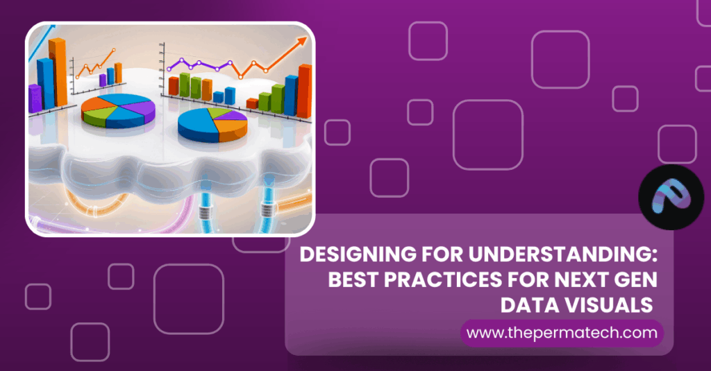
In today’s data driven world, the ability to communicate insights through visualizations has become an essential skill for professionals across industries. From dashboards to infographics, the right visualization can transform raw numbers into compelling narratives. However, choosing the right type of visualization isn’t always straightforward.
That’s where data visualization catalogues come in. These structured collections of chart types, templates, and examples help users identify the best way to represent different types of data. This guide will walk you through the most popular data visualization types, the best catalogues available, and how to choose the right visual for your data story.
Why Data Visualization Matters
Before diving into catalogues, it’s important to understand why visualization is so critical:
- Humans process visuals 60,000 times faster than text
- Visuals improve data comprehension, retention, and decision making
- They highlight trends, outliers, and patterns that are otherwise buried in raw data
In short, well crafted visuals make data accessible, actionable, and beautiful.
What Is a Data Visualization Catalogue?
A data visualization catalogue is a curated collection of charts, graphs, plots, and diagram types usually organized by function, data type, or use case. These resources help data analysts, designers, developers, and business stakeholders pick the best visual to tell their story effectively.
Catalogues often include:
- Visual samples
- Descriptions
- Use-case recommendations
- Design best practices
- Tools or code libraries
Data Visualization Categories & Examples
Let’s explore the main categories of visualizations and the most effective charts in each.
1. Comparison
Used to compare values across categories.
Best Visuals:
- Bar Chart: Compare discrete values
- Column Chart: Vertical version of bar chart
- Grouped Bar Chart: Compare subcategories side by side
- Dot Plot: Less cluttered than bar charts for many categories
When to use: Comparing sales across regions, product ratings, or budgets
2. Trends Over Time
Used to show change or progress over time.
Best Visuals:
- Line Chart: Great for continuous data over time
- Area Chart: Highlights volume as well as trends
- Sparklinem: Miniature line charts for compact dashboards
When to use: Stock prices, monthly revenue, temperature over weeks
3. Part to Whole Relationships
Shows how individual parts contribute to the total.
Best Visuals:
- Pie Chart: Use sparingly, and only with <6 categories
- Donut Chart: More aesthetic version of pie
- Treemap: Visualizes hierarchy and part to whole
- Stacked Bar Chart: Good for breakdown + total
When to use: Market share, budget allocation, survey responses
4. Distribution
Reveals how data is spread across a range.
Best Visuals:
- Histogram: Shows frequency in intervals
- Box Plot: Shows median, quartiles, and outliers
- Violin Plot: Similar to box plot but with a kernel density shape
- Density Plot: Smooth version of histogram
When to use: Exam scores, customer ages, salary ranges
5. Relationship & Correlation
Reveals how two or more variables are connected.
Best Visuals:
- Scatter Plot: Show correlation strength
- Bubble Chart: Adds size as a third variable
- Heatmap: Shows intensity with color
- Connected Scatter: Adds timeline to scatter plot
When to use: Income vs. spending, weight vs. height, risk vs. return
6. Geospatial
Used to visualize data across geographical locations.
Best Visuals:
- Choropleth Map: Color coded regions
- Dot Map: Points showing frequency
- Proportional Symbol Map: Circle size = value
- Heatmap (Geo): Density/intensity across map
When to use: Population, sales by state, climate data
7. Hierarchical
Displays nested relationships or groups.
Best Visuals:
- Tree Diagram: Parent child relationships
- Sunburst Diagram: Radial hierarchy
- Treemap: Area based hierarchical view
When to use: File systems, organizational structure, category nesting
8. Multidimensional / Complex
Used for high dimensional or interactive data.
Best Visuals:
- Radar Chart: Compare multiple variables per category
- Parallel Coordinates: Visualize multi variable data
- Sankey Diagram: Show flow from source to target
- Chord Diagram: Circular relationship between groups
When to use: Customer journeys, resource flows, multidimensional KPIs
How to Choose the Right Chart
Use this decision framework:
Understand Your Data
- Is it categorical, temporal, spatial, continuous?
Know Your Objective
- Are you comparing, showing distribution, explaining correlation?
Consider Your Audience
- Are they data savvy or business-focused?
- Do they prefer clarity or interactivity?
Avoid Chartjunk
- Eliminate 3D effects, shadows, and unnecessary decoration
Use Consistent Colors & Labels
- Align with brand style or universal cues (e.g., red = bad)
Best Practices for Designing Effective Visuals
- Simplify: Remove clutter, gridlines, and distractions
- Annotate: Add insights as captions, not just labels
- Color wisely: Use accessible color palettes (e.g., ColorBrewer)
- Align text: Horizontal labels are more readable
- Use hierarchy: Highlight key values or trends
- Test with users: Ask if they “get it” in 5 seconds
Tools to Implement These Charts
Here are tools that support nearly every chart in the catalogues above:
| Tool | Type | Best For |
| Tableau | BI Platform | Enterprise dashboards |
| Power BI | Microsoft stack | Business reporting |
| Flourish | Interactive Web | Journalistic storytelling |
| Chart.js | JS Library | Web apps and dashboards |
| D3.js | JS Framework | Custom and complex visuals |
| Plotly | Python/JS | Interactive scientific graphs |
| Matplotlib/Seaborn | Python | Static academic plots |
Conclusion: Visualization is a Superpower
Whether you’re a data analyst, marketer, or developer, mastering data visualization can elevate your communication and storytelling. A solid understanding of visualization types, supported by the right catalogue and tools, will ensure that your data speaks clearly and convincingly.So the next time you’re faced with rows of numbers or columns of survey results, don’t just dump them in a spreadsheet. Explore a chart catalogue, choose a visual that fits your story, and let the data shine.