In today’s digital era, organizations are inundated with vast amounts of data. From social media metrics and financial transactions to customer behavior and market trends, raw data in itself can be overwhelming and incomprehensible. That’s where data visualization steps in. It transforms complex datasets into visual formats like charts, graphs and dashboards, making it easier to identify trends, patterns, and insights at a glance.
Whether you’re a data analyst, marketer, executive, or student, understanding data visualization is essential in making informed decisions. In this blog post, we’ll explore what data visualization is, why it’s important, the different types of visualizations, when to use them, the top tools available, best practices, and how to get started.
What is Data Visualization?
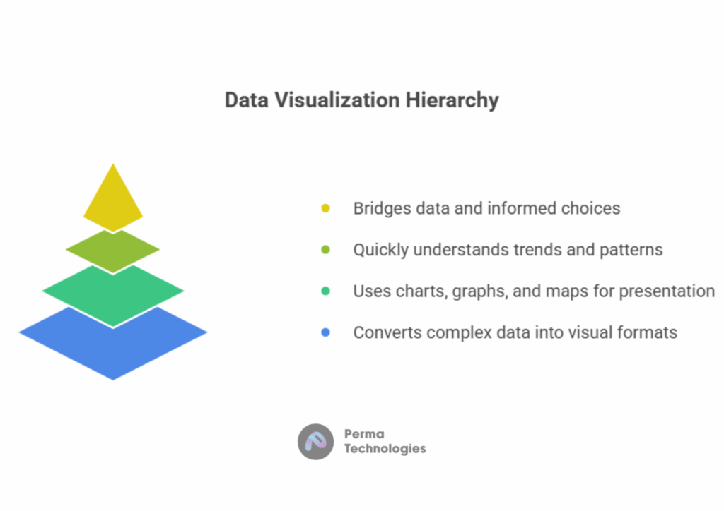
Data visualization is the graphical representation of information and data. It uses visual elements such as charts, graphs, maps, and infographics to present data in an accessible and interpretable format.
The primary purpose of data visualization is to help users quickly understand and interpret data, identify trends or outliers, and communicate findings effectively. Rather than analyzing spreadsheets or dense reports, stakeholders can gain insights through visuals that are both engaging and informative.
Popular examples include:
- Line graphs showing stock prices over time
- Bar charts comparing product sales across regions
- Pie charts representing market share distribution
- Heatmaps indicating web traffic hotspots on a website
At its core, data visualization bridges the gap between data and decision making.
Why is Data Visualization Important?
Data visualization is more than just making data look good,it enhances understanding, communication and decision making. Here are some key reasons it’s crucial:
– Improves Comprehension
The human brain processes visual information faster than text or numbers. Visualizations simplify complex datasets and make them digestible at a glance.
– Identifies Trends and Patterns
Graphs and charts can reveal patterns, trends and correlations that might not be obvious in raw data. For example, a time series graph might uncover seasonal patterns in sales.
– Facilitates Better Decision Making
When data is visualized clearly, businesses can make evidence based decisions faster and with more confidence. Leaders can spot opportunities or issues and act proactively.
– Enhances Communication
Visuals are a universal language. Whether presenting to stakeholders, clients or the public, data visualization helps convey the message effectively and persuasively.
– Supports Data Storytelling
Data visualizations are powerful storytelling tools. They guide audiences through a narrative, supporting claims with compelling visuals and enhancing engagement.
Different Types of Data Visualization (and When to Use Them)
Choosing the right type of visualization depends on your data and the message you want to convey. Here are some common types and their ideal use cases:
– Bar Charts
Used to compare quantities across categories. Ideal for visualizing survey results, product sales, or revenue by region.
– Line Graphs
Perfect for showing trends over time, such as website traffic, monthly expenses, or stock prices.
– Pie Charts
Useful for illustrating proportions or percentages of a whole. Best when you have limited categories (less than six).
– Histograms
Display the distribution of data across intervals. Commonly used in statistics and quality control.
– Scatter Plots
Great for exploring relationships or correlations between two variables (e.g., height vs. weight).
– Heatmaps
Use color gradients to show density or intensity. Ideal for representing correlations, user activity, or geographical data.
– Maps (Choropleth, Bubble, Geospatial)
Useful for visualizing data tied to locations, like population density or election results.
– Dashboards
Combine multiple visualizations in a single interface. Often used in business intelligence for real time data monitoring.
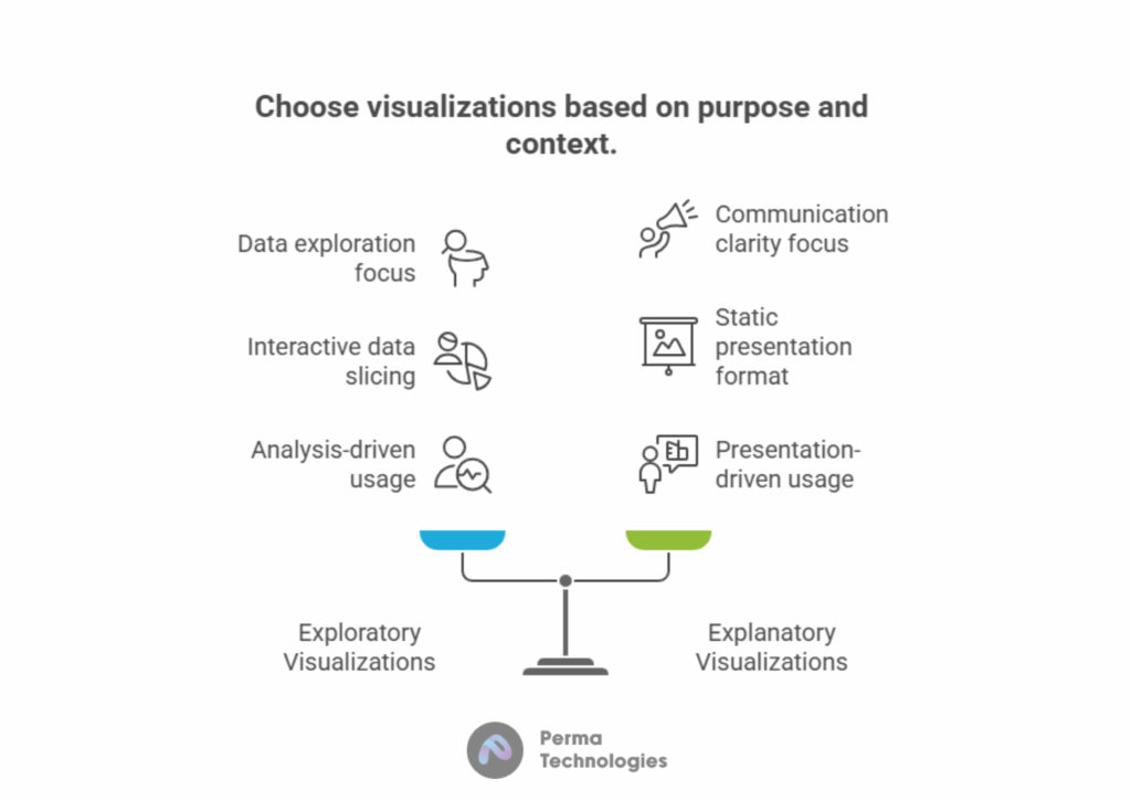
Exploration vs. Explanation
Data visualizations generally fall into two broad purposes:
a. Exploratory Visualizations
Exploratory Visualizations are used during analysis to explore data, spot trends, and identify patterns. Often interactive, they help analysts dig deeper and slice/dice the data.
Examples:
Scatter plots (to find correlations)
Box plots (to analyze distributions)
Histograms (to see frequency of values)
b. Explanatory Visualizations
Explanatory Visualizations are designed to communicate a specific message or insight to an audience. They’re typically static and are often used in reports or presentations.
Examples:
Bar charts (for comparison)
Line charts (to show trends over time)
Pie charts (for proportions)
Infographics (for storytelling)
When Should You Visualize Your Data?
Not every dataset needs visualization, but many benefit from it. Here are situations when you should definitely consider visualizing your data:
– To Explore and Understand Data
Before analysis, visuals help detect anomalies, patterns, and potential errors in datasets.
– To Present Findings
Visuals are a must when presenting results to clients, teams, or leadership. They make your insights digestible and persuasive.
– To Monitor Performance
Dashboards that track KPIs in real time (e.g., conversion rates, uptime, revenue) rely on visualization for instant awareness.
– To Compare Metrics
Visuals can effectively compare performance across departments, regions, or time periods.
– To Make Predictions
Forecasting trends using historical data often requires line graphs or regression visuals to illustrate future possibilities.
Top Data Visualization Tools
A wide range of tools cater to different needs, from business dashboards to complex analytics. Here are some of the most popular:
– Tableau
A leader in business intelligence, known for its powerful dashboard capabilities and easy to use drag and drop interface.
– Power BI
Microsoft’s visualization tool that integrates seamlessly with Excel, Azure, and other Microsoft products. Ideal for enterprise reporting.
– Google Data Studio
A free and accessible tool for building dashboards using Google Analytics, Sheets, Ads and more.
– Looker (now part of Google Cloud)
Enterprise level platform offering deep analytics and integrated BI experiences.
– D3.js
A JavaScript library for building interactive and customizable visualizations, ideal for developers.
– Plotly
Plotly,Used for scientific and business visualizations, supporting Python, R, and JavaScript.
– Excel
Still widely used for basic charts, pivot tables, and business reporting.
Best Practices and Principles for Effective Data Visualization
Creating an effective data visualization isn’t just about aesthetics. Here are some essential principles to follow:
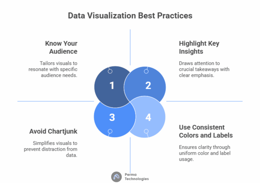
– Know Your Audience
Understand who you’re designing for. A technical audience may prefer detailed graphs, while executives might want high level insights.
– Choose the Right Chart Type
Pick a visualization type that matches your data and goals. Don’t force a pie chart when a bar chart is clearer.
– Avoid Chartjunk
Too many colors, 3D effects or unnecessary decorations can distract from the data. Simplicity often leads to clarity.
– Use Consistent Colors and Labels
Use color schemes meaningfully (e.g., red for negative, green for positive) and label axes clearly.
– Highlight Key Insights
Use callouts, bold labels or contrasting colors to draw attention to the most important takeaways.
– Maintain Data Integrity
Always represent data accurately avoid manipulating axis scales or using misleading visuals that distort the message.
– Test and Iterate
Share your visuals with others before publishing to gather feedback on clarity and usefulness.
Getting Started with Data Visualization
If you’re new to data visualization, here’s a step by step guide to start creating impactful visuals:
Step 1: Identify Your Goal
Ask: What insight am I trying to communicate? Who is my audience? What action should they take?
Step 2: Collect and Clean Data
Use tools like Excel, Google Sheets, or programming languages like Python (Pandas, NumPy) to prepare your dataset.
Step 3: Choose the Right Tool
Pick a tool based on your needs Excel for quick graphs, Tableau for dashboards, or Python (Matplotlib, Seaborn) for custom plots.
Step 4: Create Visualizations
Design your visuals while adhering to the best practices above. Focus on clarity, accuracy, and storytelling.
Step 5: Refine and Share
Edit your visuals based on feedback, and publish them in reports, dashboards, or presentations.
Conclusion
Data visualization is a vital skill in today’s data driven world. It empowers professionals across industries to understand data, communicate insights, and drive decisions. Whether you’re analyzing trends, presenting to stakeholders, or building dashboards, mastering data visualization can amplify your impact.